CHRISTIAN BRETT & BRACKET PRESS

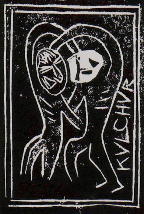
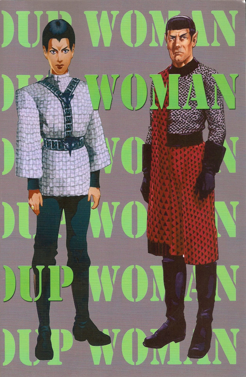
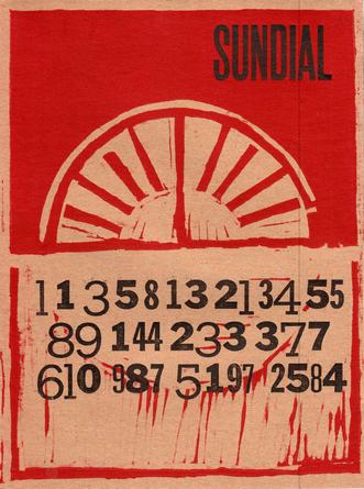
Working closely with Gee Vaucher and Penny Rimbaud—both formerly of Crass—printer and publisher Christian Brett has spent the past couple of years bringing out strikingly immaculate letterpress publications through his own imprint, Bracketpress. The work—which comes out of Lancashire, England—synthesizes digital design and fine letterpress printing such that each publication, whether a hand-stitched book or a simple card, is indeed something to behold. Although these publications are carefully designed and produced, Brett's aesthetic sensibility seems, on a number of levels, to gesture toward the type of cultural production Crass themselves were invested in from the mid 1970s through 1984.
Often referred to as simply a band that brought out music, the scope of the work Crass did was far broader, extending into nearly every sphere of the arts. Film. Visual Art. Performance. Sound. Written work. Their lyrics, produced in a fury but thoughtfully written, often involved an investigation into the complex relations between language and ideology, the religious and political, the social and the singular. The fullest expression of this investigation can be found in "Reality Asylum." Backed by a series of discordant sounds which grow increasingly louder as the song progresses, becoming at first unsettling and then overwhelmingly ominous, the words of the song are uttered in a tone of abject defiance:
Their lyrical work, written collectively to be performed collectively, is akin to that of Adrian Mitchell or Attila the Stockbroker. Although pegged and tauted as a punk band, most of the members of Crass were much older and far more committed to exploring the intersections of art, literature and activism.
Gee Vaucher, doing most of the visual and design work for the group, was already in her mid-thirties by the time of their first public performance. Before joining the collective, based around the Dial House in Essex, she worked in New York as a freelance artist, contributing visual work to a number of magazines and journals, including New York Magazine and Rolling Stone. Before that she worked on other commercial projects and illustrated countless children's books.
Penny Rimbaud, who performed on drums and provided the rhetorically incendiary prose included in Crass albums, was also in his mid-thirties when the group formed. As a young man in his mid-twenties he flew to the US and for two months traveled across the country, maintaining a journal throughout his travels. On returning to England he revised this journal into a work later published under the title The Diamond Signature. Lawrence Ferlinghetti later referred to the work as "An enor-mously Ambitious + sonorous work of the Eye-magination."
Once Crass broke apart in 1984 both Vaucher and Rimbaud moved onto other projects which continued to synthesize cultural production and political activity. In recent years Christian Brett has joined them in various collaborative projects.
In 2006 Vaucher and Brett constructed "The Sound of Stones in the Glass House," an installation project exhibited at various locations in both the UK and US. The project is a simple steel-framed structure of frosted glass resembling a house or home. Cut out of the frosted coating is a seemingly endless catalog of US military interventions into foreign nations. The floor within the structure is a carpet of soil and grass. The sound inside is, of course, silence. On the soil, in the grass, inside the structure which resembles home, one finds oneself surrounded by language and indeed it is only through language, through the shapes of linguistic characters, that one can from within look out to the surrounding world. It is only through the letters that outside light can get into and nourish the grass which carpets the structure. Here language mediates all vision and light which enters in and exits out of the structure. This language is a language of war and aggression. Speaking directly, the first line of the press release for the installation states: "This exhibition is staged as a response to the events of September 11th, 2001 and the ensuing global aftermath."
As typographer and book designer, Brett has collaborated with Penny Rimbaud on a number of publishing projects brought out through Bracket: How?, In The Beginning Was The Word, and most recently The Conveniences of Philosophy. Each of these chap-size publications are part-letterpress, part-offset, all hand-stitched. Although Rimbaud is credited as author, the work is collaborative inasmuch as Brett's typographical and design decisions inform in part how each work is received and read. On each we find the residual print of the human hand. Each carries the aura of care. The work is that of exacting precision but also speaks something of the same sensibility found in early Futurist publications.
 Each design and typeface selection seems to be driven by the specific demands of the project, such that each is appropriate to the project, drawing out further in a tangible and material way the force which resides in each work. We see this in the colophon of each, which not only indicates the typeface used, but offers information about each typeface in order to further in rich our readings of the work.
For The Conveniences of Philosophy Brett selected Sabon, a serifed typeface which he tells us was "Designed by Jan Tschichold in 1965 for German master printers who required that it should be produced in identical form for both mechanical composition by the Linotype and Monotype foundries...." Curiously enough, Sabon was used in 1979 for setting the Episcopal Church's Book of Common Prayer. Aware of this curious relation, however accidental it may be, I find myself reading one among a number of catechismic exchanges Rimbaud includes in The Conveniences: "QUESTION: how is it Christ died for our sins two thousand years before we committed them?/ ANSWER: how is it Christ died for our sins two thousand years before we committed them?" Invested in a strange Rexrothesque anarcho-mysticism, the text, set in Sabon, becomes its own Book of Common Prayer. It is in this way that Brett collaboratively enters into the work of Rimbaud.
Like the now-classic work of Wallace Berman, Dave Haselwood, and William Everson, Christian Brett's ability to foreground through design the aura residing within a textual work is, as I say, something to behold.
_______________________
ADDENDUM: Christian Brett tells me that, while the choice of the Sabon typeface was not made as a conscious gesture toward the 1979 Book of Common Prayer, Rimbaud's Conveniences was previously set in Baskerville and the two-column bible-like format of the text was designed with John Baskerville's bible of 1763 in mind.
Often referred to as simply a band that brought out music, the scope of the work Crass did was far broader, extending into nearly every sphere of the arts. Film. Visual Art. Performance. Sound. Written work. Their lyrics, produced in a fury but thoughtfully written, often involved an investigation into the complex relations between language and ideology, the religious and political, the social and the singular. The fullest expression of this investigation can be found in "Reality Asylum." Backed by a series of discordant sounds which grow increasingly louder as the song progresses, becoming at first unsettling and then overwhelmingly ominous, the words of the song are uttered in a tone of abject defiance:
For you lord./ You are the flag-bearer of these nations/ One against the other that die in the mud/ No piety. No deity
[...]
The cross is the mast of your oppression/ You fly there, vain flag. You carry it/ Wear it on your back, Lord. Your back/ Enola is your gaiety/ Suffer little children to come unto me/ Suffer in that horror. Hirohorror. Hirrohiro/ Hiroshimmer. Shimmerhiro. Hiroshima. Hiroshima
Their lyrical work, written collectively to be performed collectively, is akin to that of Adrian Mitchell or Attila the Stockbroker. Although pegged and tauted as a punk band, most of the members of Crass were much older and far more committed to exploring the intersections of art, literature and activism.
Gee Vaucher, doing most of the visual and design work for the group, was already in her mid-thirties by the time of their first public performance. Before joining the collective, based around the Dial House in Essex, she worked in New York as a freelance artist, contributing visual work to a number of magazines and journals, including New York Magazine and Rolling Stone. Before that she worked on other commercial projects and illustrated countless children's books.
Penny Rimbaud, who performed on drums and provided the rhetorically incendiary prose included in Crass albums, was also in his mid-thirties when the group formed. As a young man in his mid-twenties he flew to the US and for two months traveled across the country, maintaining a journal throughout his travels. On returning to England he revised this journal into a work later published under the title The Diamond Signature. Lawrence Ferlinghetti later referred to the work as "An enor-mously Ambitious + sonorous work of the Eye-magination."
Once Crass broke apart in 1984 both Vaucher and Rimbaud moved onto other projects which continued to synthesize cultural production and political activity. In recent years Christian Brett has joined them in various collaborative projects.
In 2006 Vaucher and Brett constructed "The Sound of Stones in the Glass House," an installation project exhibited at various locations in both the UK and US. The project is a simple steel-framed structure of frosted glass resembling a house or home. Cut out of the frosted coating is a seemingly endless catalog of US military interventions into foreign nations. The floor within the structure is a carpet of soil and grass. The sound inside is, of course, silence. On the soil, in the grass, inside the structure which resembles home, one finds oneself surrounded by language and indeed it is only through language, through the shapes of linguistic characters, that one can from within look out to the surrounding world. It is only through the letters that outside light can get into and nourish the grass which carpets the structure. Here language mediates all vision and light which enters in and exits out of the structure. This language is a language of war and aggression. Speaking directly, the first line of the press release for the installation states: "This exhibition is staged as a response to the events of September 11th, 2001 and the ensuing global aftermath."
As typographer and book designer, Brett has collaborated with Penny Rimbaud on a number of publishing projects brought out through Bracket: How?, In The Beginning Was The Word, and most recently The Conveniences of Philosophy. Each of these chap-size publications are part-letterpress, part-offset, all hand-stitched. Although Rimbaud is credited as author, the work is collaborative inasmuch as Brett's typographical and design decisions inform in part how each work is received and read. On each we find the residual print of the human hand. Each carries the aura of care. The work is that of exacting precision but also speaks something of the same sensibility found in early Futurist publications.
 Each design and typeface selection seems to be driven by the specific demands of the project, such that each is appropriate to the project, drawing out further in a tangible and material way the force which resides in each work. We see this in the colophon of each, which not only indicates the typeface used, but offers information about each typeface in order to further in rich our readings of the work.
For The Conveniences of Philosophy Brett selected Sabon, a serifed typeface which he tells us was "Designed by Jan Tschichold in 1965 for German master printers who required that it should be produced in identical form for both mechanical composition by the Linotype and Monotype foundries...." Curiously enough, Sabon was used in 1979 for setting the Episcopal Church's Book of Common Prayer. Aware of this curious relation, however accidental it may be, I find myself reading one among a number of catechismic exchanges Rimbaud includes in The Conveniences: "QUESTION: how is it Christ died for our sins two thousand years before we committed them?/ ANSWER: how is it Christ died for our sins two thousand years before we committed them?" Invested in a strange Rexrothesque anarcho-mysticism, the text, set in Sabon, becomes its own Book of Common Prayer. It is in this way that Brett collaboratively enters into the work of Rimbaud.
Like the now-classic work of Wallace Berman, Dave Haselwood, and William Everson, Christian Brett's ability to foreground through design the aura residing within a textual work is, as I say, something to behold.
_______________________
ADDENDUM: Christian Brett tells me that, while the choice of the Sabon typeface was not made as a conscious gesture toward the 1979 Book of Common Prayer, Rimbaud's Conveniences was previously set in Baskerville and the two-column bible-like format of the text was designed with John Baskerville's bible of 1763 in mind.


<< Home